


#18 Colours are fundamental to express the image of the characters.
🌞☕🫖 Take your coffee (or tea) and enjoy this lovely Sunday morning reading.


For some time now, I've been meaning to talk about the change in style and, in particular, the colours used by Penelope Featherington, played by Nicola Coughlan, the Netflix series Bridgerton.
The last season - consisting of parts one and two - brought a different Penelope to the public, and for good reason.
As dictated by Julia Quinn’s novels of the same name, the Featheringtons have one of the tawdrier color palettes in the show of sickly-sweet oranges, yellows and greens. Compared to the sumptuous Bridgerton blues and the opulent cream and gold hues that the ladies of the Ton are bathed in, it’s led Penelope to stand out — and not in a good way.

In the first episode of season three (the last one yet), Penelope becomes embarrassed by her own irrelevance in society and decides it’s time for a change. In the modiste, she declares: “I do not wish to see a citrus color ever again.” Cue a major makeover, which sees the social wallflower swap out her garish garments for sensual pastel gowns with delicate embellishments and a flattering square-cut neckline.
Penelope then left behind clothes in vibrant colours that hid her curves to adhere to a new style signature with codes that express sensuality, self-confidence and a more mature and wealthy woman.

From the writing in the paragraph above, you can see that Penelope had a change of behaviour which led to an interest in adapting her image. And she has used colour as a tool, changing the shape of the silhouette of her clothes and also her hair, which has now become a beautifully voluminous and powerful red.
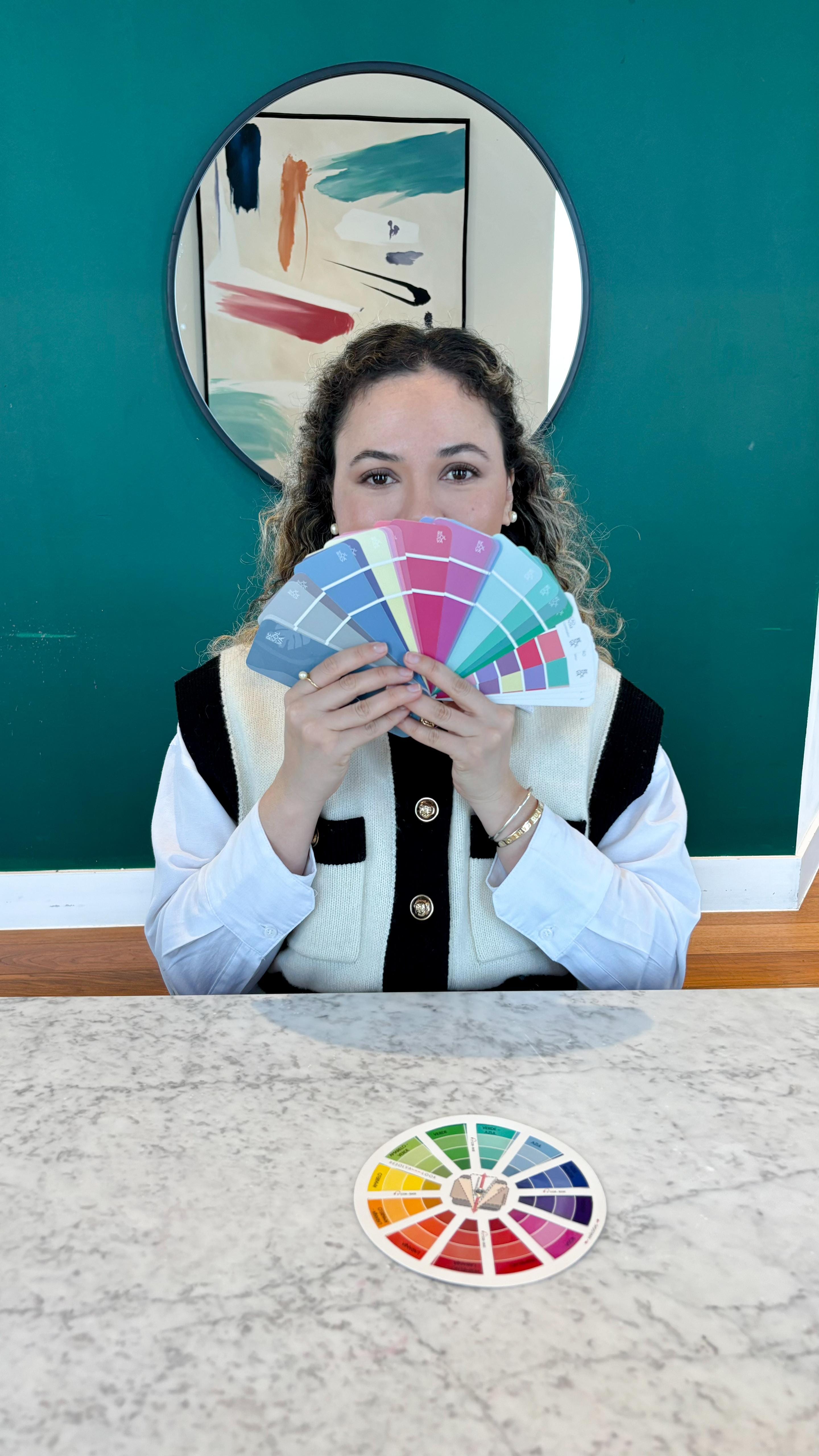
There is a stage in the style consultation where we carry out a personal colour analysis and discover the seasonal colour palette that best suits the client's skin type, which can be warm or cool, intense or soft, light or dark.
And there is another stage where we define a colour palette for the wardrobe according to the client's image desires. To do this we use the colour palette diagnosed in the analysis, but there is no obligation to follow it exactly, as I teach my clients how to cleverly work around the palette.
When I analysed Penelope Featherington's image change, I couldn't help but make the connection with our personal style. Just like the characters, we have a life story that gives us the freedom to create a style signature, which may have many or few colours, but which must also follow certain social codes of appropriateness, distinction and even as an affirmation of rebellion.
In fact, I have a striking example of a change in style that expresses rebellion. And when I say rebellion, I don't mean being an anarchist or going against traditional moral values. Rebellion is acting in a way that is unexpected by the people you meet and by society.
By the way, Miranda Hobbs, from Sex & City and its spin-off Just Like That, made a wardrobe change between the two series to reflect her life change that includes rebellion

In the first season of Just Like That, we saw a very different M Hobbs from the one we knew in the 90s and 2000s. The woman with the matching suits, the straight, square lines and sober colours that expressed her more conservative and rigid vision of life gave way to the new Miranda, who is back at university, has left her prestigious law firm to live a low profile life in favour of social causes and has allowed herself to be discovered sexually. The old clothes no longer make sense in the life of such a free, happy, fluid and fulfilled character.
Miranda hasn't changed her essence, so the tailoring is still there, as is her short, pointy haircut, but the colours are now intense, vibrant, there are colour combinations and textures that aren't too obvious, and we can also see that Miranda is more stylish and in tune with what's trending.

I bet you've seen a friend or relative go through some momentous event and then their image. Chances are you've experienced it too, don't you think? Perhaps you've started a new job and bought an outfit to impress on your first day, or you've been through a pregnancy and no longer recognise yourself in your old wardrobe, as if it didn't fit in with your current life. And all these perceptions come down to colours, because they have an impact on our mood, our self-confidence and also on how we are perceived by people.
No wonder colours are an asset in marketing campaigns. Red is associated with urgency and also triggers hunger, while blue is widely used in health, beauty and wellness because it is a calming colour that conveys trust and familiarity. The energy of yellow can be found in cheerful architecture and in brands that sell emotion, such as McDonald's. But that's for another article.
One of my clients told me something remarkable:
“- discovering my seasonal colour chart settled me free!”
I couldn't agree more! If you would like to discover your colour palette and use it in an image strategy, or simply find out which make-up and hair tones work best for you, book a personal colour analysis session with me.
As an added bonus, my August clients will have access to a DIOR make-up lesson to learn how to enhance their natural beauty step by step.
With my colour expertise and the specialised services of the DIOR Beauty team, I'll help you discover the best shades for foundations, lipsticks, eyeshadows and more.
But please be aware that you are under no obligation to do anything, okay? The class is just an invitation to continue the luxury experience of colour beauty.
During the personal colour analysis session, we'll also analyse the make-up and nail polish you already have at home. This way I can show you what's part of your colour palette and teach you how to use the others that aren't in a smart way.
Exclusively for the month of August, the Personal Colour Analysis is priced at £150 and includes a digital dossier with all the precise information for you and your image strategy. Find out: how to use colour, how to cheat on colour, colour suggestions for make-up, hair, a colour palette for your strategic wardrobe and other learning features.
To speak to me, reply to this email, send me a message on Instagram or join the waiting list so I can get in touch with you.
It may not be a statement of style, but the click is a step in the fashion direction:
✨ A very well curated content about what it's like to be an Hermés customer (a customer of the shops themselves).
✨Harvey Nichols is having a sale this weekend, with at least 15% off beauty, as well as summer sales in other categories. Use my link to get an extra 15% off purchases over GBP 350.
✨A moisturising face cream that I'm loving using. It leaves the skin radiant and ready for make-up.
Did you like this edition of the newsletter? Forward it to a friend who might like it too. Oh, I'd love to hear your feedback, so feel free to reply to this email, send me a direct message on Instagram or leave a comment on the link below:
Copyright © 2024 Camila Rosa Personal Stylist. All intellectual and creative rights reserved.